Invisible ink
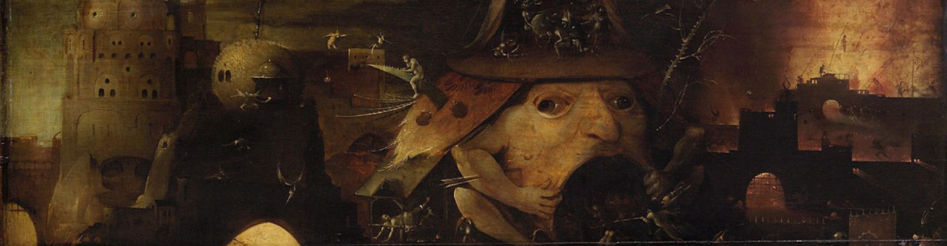
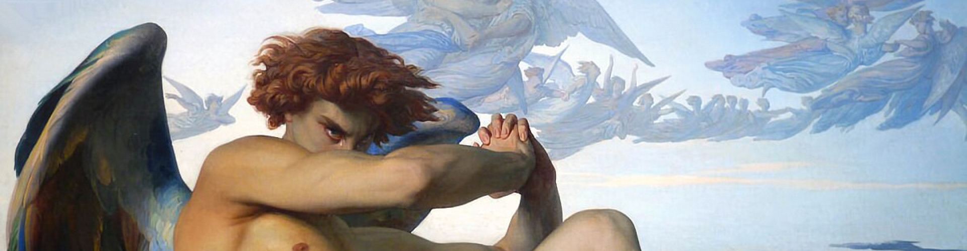
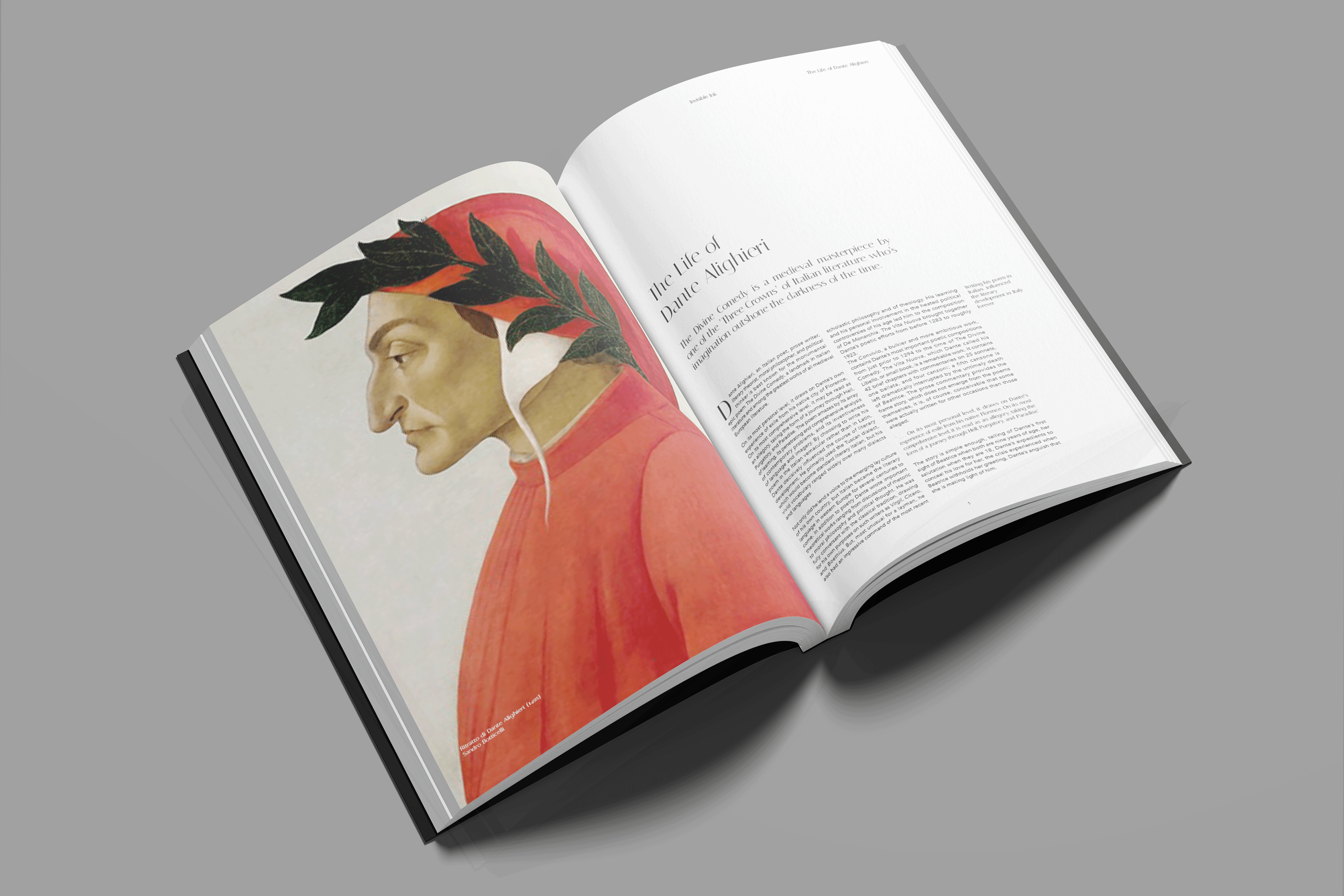
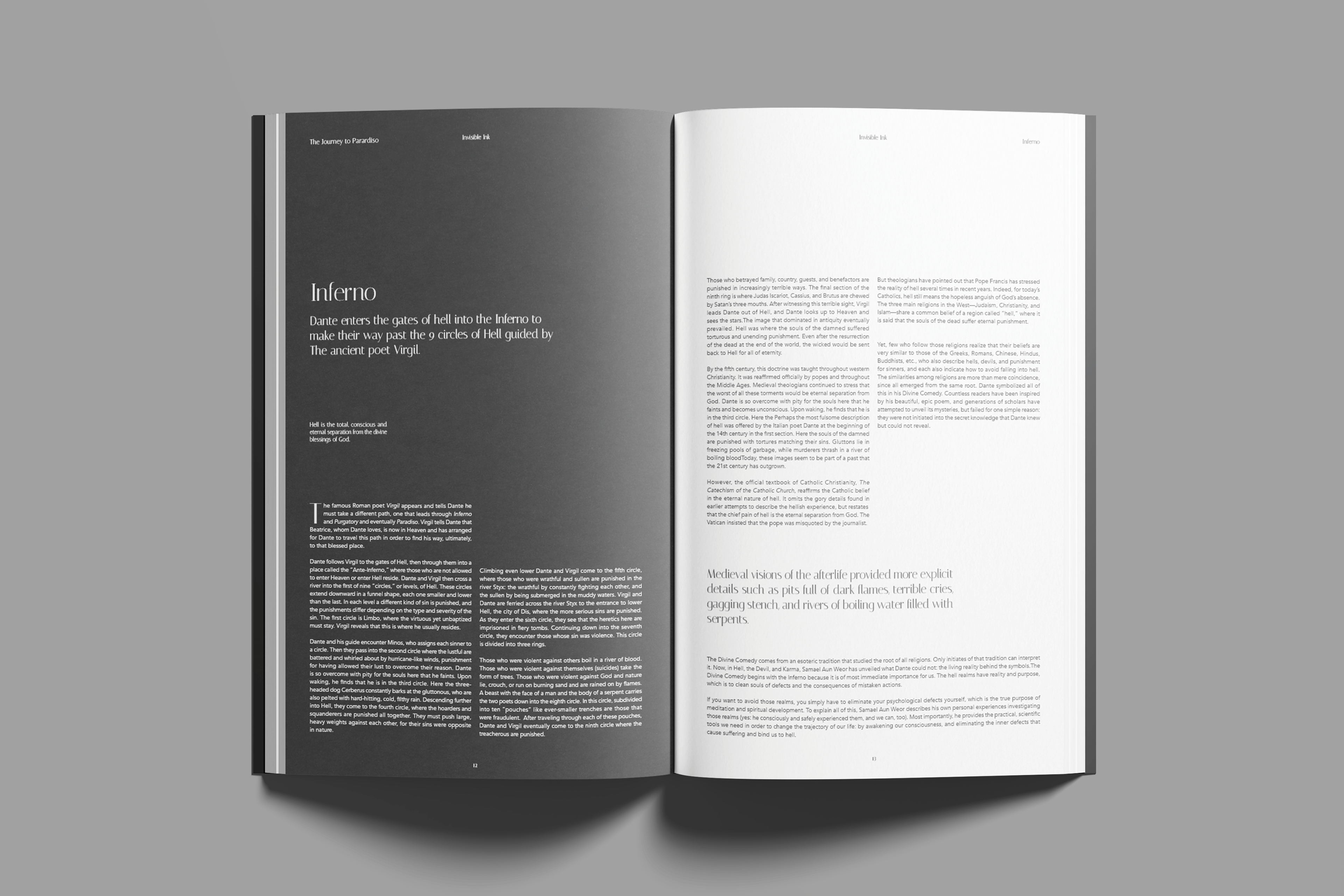
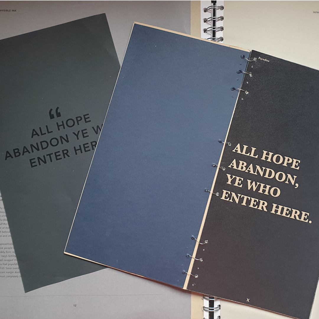
Invisible ink was my response to the ISTD 2020 brief: Paradiso, which asked us to tell the story of The Divine Comedy to a new audience. I created a publication that told the story but with the visual tone, layout and pacing of the publication inspired by the symbolism of Dante's decent into inferno and subsequently his ascent into Paradiso. I chose to focus on the theme of spiritual blindness, which was a repetitive metaphor throughout the poems.
This project allowed me to hone my typographic and creative layout skills and also my understanding of large-scale print processes and publication binding.
I was delighted to be awarded membership to the ISTD (International Society of Typographic Designers) as a result of my successful submission.

I experimented with a large variety of paper stocks and printing methods.
This project allowed me to build up my experience working with professional printers, specifically looking at paper stock, and colour printing theory and the intricacies of printing large publications, as well as being able to personally try different binding methods.